 Aspecten
 Download (35 MB)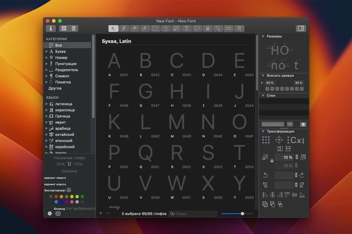
What changed in Glyphs 4.1.1
Build 4.1.1, dated 2026-09-12, tightens up text handling inside the editor. The contextual menu for text fields now behaves more predictably when you select, copy, or paste glyph names and font metadata, removing a small but persistent friction in daily type design work.
How do you start a new font project?
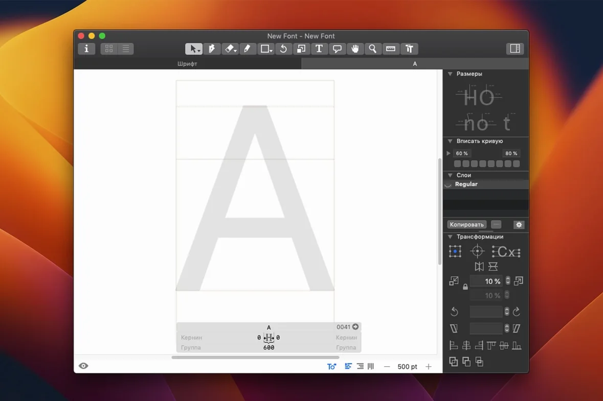
You begin in a clean, single-window workspace that shows only the drawing area and a sidebar for glyphs, layers, and font info. The interface stays out of the way so you can define a few core letters right away, sketching with the vector drawing tools or importing outlines from Illustrator.
What does drawing a character feel like?
Editing happens on a node-and-handle level, with live interpolation previews that let you check how a bold weight will look before you draw it. The tool palette shows only what the current selection needs, so the screen never feels cluttered even when you are deep in Bézier adjustments.
How does the app handle OpenType features?
Scripting support and automatic feature generation let you build ligatures, alternates, and positional forms without writing OpenType code by hand. The font window compiles everything into a working OpenType file you can test directly in other Mac apps through the system font menu.
How Glyphs compares with other Mac font editors
Type designers on macOS tend to circle around three tools — Glyphs, RoboFont, and FontLab 8. Each one takes a different view of what a font editor should be, and the choice usually depends on how you like to work rather than any clear winner on features.
RoboFont shares the most DNA with Glyphs. Both are Mac-native, both lean on Python scripting, and both draw with a light, responsive Bézier engine. The difference is in the starting point. RoboFont ships as a minimal shell and expects you to build your own environment through extensions. Glyphs gives you a complete workspace right away — drawing tools, OpenType feature UI, interpolation previews, a font info panel — and still lets you extend it. For a designer who wants to open the app and start drawing letters without assembling the interface first, Glyphs feels more direct. For someone who wants every panel and menu to be exactly their own, RoboFont provides that blank canvas.
FontLab 8 crosses platforms and packs in a deeper set of drawing and editing tools — knife tools, power guides, more advanced metrics windows. It can do things Glyphs does not attempt, especially around legacy font formats and complex contour operations. The trade-off is interface density. FontLab's windows hold more controls at once, which is powerful but can slow down the rhythm of moving between glyphs. Glyphs keeps fewer controls visible and surfaces them contextually, which matches a workflow built around fast switching and sketching.
There is also BirdFont, which runs on Mac but comes from a different philosophy. It is simpler throughout, suitable for smaller type projects or icon fonts. It lacks the interpolation engine and scripting depth that define the professional trio. Compared to Glyphs, BirdFont feels closer to a vector drawing app that happens to export fonts.
Contextual menus in text fields now respect Mac conventions
Build 4.1.1 fixed the contextual menu behaviour in text fields, which sounds minor until you spend a day entering glyph names and OpenType class definitions. The menu now respects standard Mac text-editing conventions — double-click to select a word, right-click to copy or paste without the selection jumping — so the text-heavy parts of type design (naming glyphs, writing feature code snippets, filling in metadata) feel less like fighting a custom text engine.
Earlier in the version 4 cycle, the drawing tools gained a reworked node selection system. You can now select nodes across multiple contours with a marquee drag and transform them together, which speeds up adjusting serifs or terminals that repeat across a character set. The layers panel also received refinements that make it easier to compare intermediate masters side by side, with clearer visual feedback when a layer is locked or hidden.
Export formats expanded to include SFSymbols support, so icon designers can now work on symbol fonts for Apple platforms directly from the same file they use for the rest of the type family. The PNG, SVG, and PDF export paths remain available for specimen sheets and documentation.
Four upright masters and an italic companion, starting with n, o, p
Consider someone designing a humanist sans-serif with four weights and an italic companion. Monday starts in the Font Info panel, setting up masters for Light and Bold uprights. The designer draws a few lowercase letters — n, o, p — and toggles the interpolation preview to check that the middle weights will hold together. By Tuesday, the character set grows, and the designer uses the sidebar search to jump between glyphs by name, avoiding endless scrolling through a 600-character list.
Midweek, attention turns to diacritics. The glyphs free download approach — meaning the freely configurable component system inside the app — lets the designer build accented characters from base letters and combining marks without redrawing each one. Thursday brings OpenType feature testing. Ligatures and stylistic alternates get defined through the feature interface, and the designer tests them live in Glyphs Viewer, the companion preview app that shows the font in system-level text rendering. By Friday, the font exports as a working OpenType file and gets tested in InDesign and a browser. The whole cycle happens in one application, without switching to separate tools for drawing, spacing, feature coding, and testing.
Drawing half the lowercase before setting any sidebearings
The first common slip is drawing too many glyphs before checking spacing. A beginner often draws half the lowercase alphabet with no sidebearings set, then has to revisit every glyph to adjust them. Setting spacing on a few core letters — n, o, p — and testing the rhythm early saves that backtracking. Glyphs makes it easy to copy sidebearing values between similar glyphs, but only if you set them early enough to benefit.
Another frequent misstep is ignoring the layers panel when building multiple masters. Beginners sometimes draw a Light master on one layer and a Bold master on a separate layer without linking them properly in the font info. The interpolation preview then shows mismatched outlines or broken curves. The fix is straightforward — assign each layer to the correct master in the Font Info panel — but the mistake costs time when you see interpolation errors late in the project.
A subtler error comes from overusing the automatic OpenType feature generator without reviewing the output. The generator can produce working code for ligatures and positional forms, but it sometimes creates rules that overlap or conflict with custom feature code added manually. Checking the generated feature code before export prevents surprises when the font behaves differently in a layout engine than it did inside Glyphs.
Finally, beginners occasionally skip the right-to-left and complex-script testing steps. Glyphs supports Arabic, Hebrew, and Indic scripts through its shaping engine integration, but the editor does not automatically flag missing positional forms for scripts the designer is not actively drawing. A font that works beautifully in Latin text can fail in a short Arabic sample simply because the required initial, medial, final, and isolated forms were never added. Running a quick test with real text in each supported script — even if only a few words — catches those gaps before export.