 Aspecten
 Download (159 MB)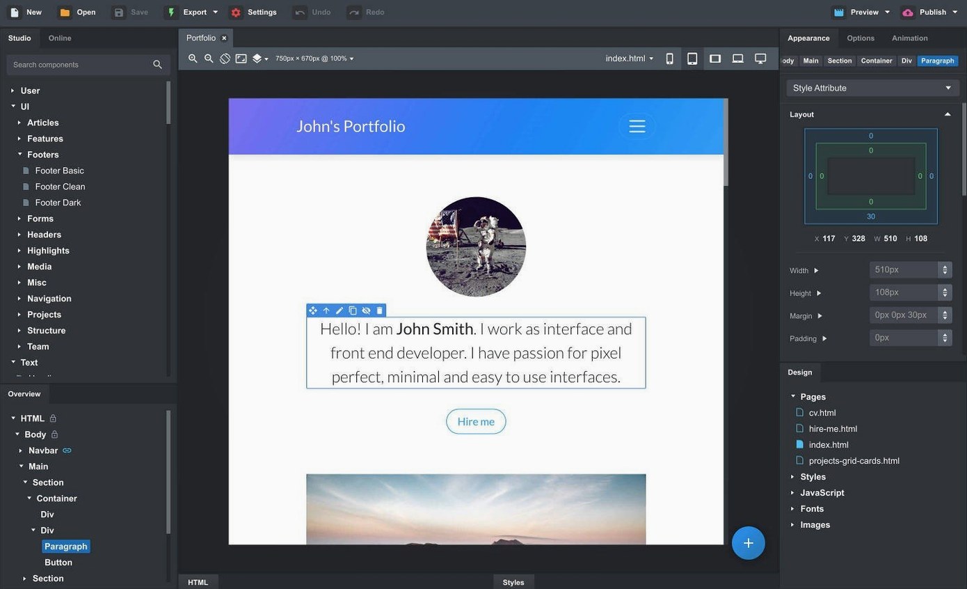
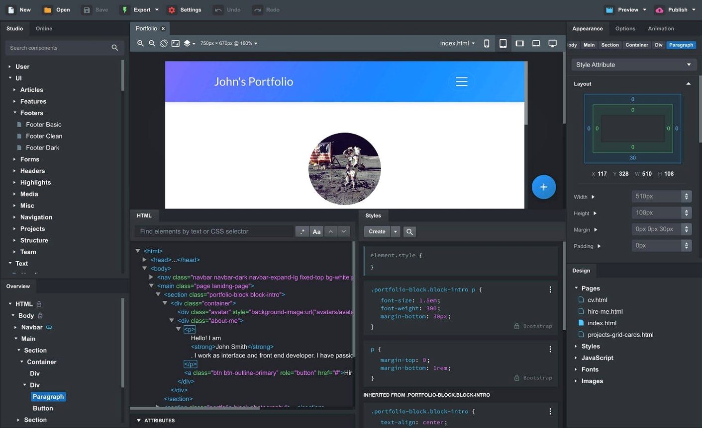
Hand-coding a responsive website from scratch demands a good deal of time, even when you lean on a framework like Bootstrap. Bootstrap Studio sidesteps that by turning the framework into a visual, drag-and-drop environment on your desktop. You assemble pages from pre-built components, see the result in real time, and export clean HTML when you are done. The question for Mac users is simply whether it will run.
Drag-and-drop Bootstrap pages with linked headers and footers
- Anyone who wants responsive Bootstrap sites without writing every line by hand
- Working with Bootstrap 3.4, 4.6, or 5.3 inside one application
- Keeping a header or footer synchronised across pages via linked components
- Previewing work across multiple browsers and device sizes simultaneously
macOS 10.13+ required, custom CSS still helps for complex layouts
- You need macOS 10.13 or newer; the app runs on both Intel and Apple Silicon Macs
- The built-in components cover common needs (headers, galleries, slideshows, divs), but complex custom layouts still benefit from CSS knowledge
- Interface support is English-only
Nesting a div in the wrong spot breaks the generated markup
One of the more frequent points of confusion is the component hierarchy. Dragging a div into another div looks simple, but Bootstrap Studio relies on precise nesting to generate correct markup. If a component lands in the wrong spot, the visual canvas shows it but the exported HTML surprises you. The fix is to keep the Overview panel open and check the parent-child relationship before you start styling. A small habit that saves a good deal of rework.
Importing an existing site can also trip people up. You drag in HTML, CSS, JS and image files, but the app does not always map external stylesheets to the correct pages automatically. When columns break or typography looks off after import, open the Design panel and verify that each page references the stylesheets you expect. Often the problem is a missing link, not a broken import. Re-attaching the CSS file usually sorts it.
Another snag involves SCSS. The editor supports creating and editing .scss files fully, but variables declared in one file are not automatically available in another unless you import them explicitly. If a compiled style comes out blank, check the import chain. Bootstrap Studio compiles in order, and a missing @import at the top of the file is the culprit more often than not.
The live preview across multiple browsers and devices is a strong feature, but it can consume a noticeable amount of memory on Macs with 8 GB of RAM, especially when you keep several preview windows open. If the canvas becomes sluggish, close the previews you are not actively using and reopen them when needed. The desktop app itself stays responsive once you free those resources.
Designers who know the grid but want to skip repetitive markup
Web designers who are comfortable with Bootstrap’s grid system but tired of typing out repetitive markup tend to settle in quickly. The component library covers the structural building blocks—headers, footers, galleries, slideshows, spacers—so the routine parts of a layout come together fast. That leaves more room for fine-tuning typography, colour and spacing, where the real design decisions happen.
Frontend teams working on prototypes also find a natural fit. Because linked components stay synchronised across pages, a change to a shared navigation bar or footer propagates everywhere without manual copying. A designer can hand over a working set of HTML pages to a developer, and the output is semantic enough to serve as a starting point rather than something that needs a full rewrite. The three Bootstrap versions (3.4, 4.6 and 5.3) in one tool mean you can match the framework version a project already uses, which is helpful when maintaining older sites alongside newer work.
Users who search for bootstrap studio mac often fall into two groups: those who have used the framework before and want faster iteration, and those learning Bootstrap who benefit from seeing how components translate into markup. The second group picks up the grid logic more quickly because dragging a column and watching the canvas update makes the breakpoint behaviour visible in a way that code alone does not always convey.
Build a three-page site with linked components on day one
Start with a small project rather than a full site. Create three pages—home, about, contact—and use linked components for the header and footer right away. That forces you to understand the synchronisation mechanism early, and the habit sticks.
Spend half an hour with the online component library. Community-created components fill gaps that the built-in set does not cover, and pulling one in is as simple as dragging it onto the canvas. Before you build a complex slideshow or a pricing table from scratch, check whether someone has already shared a version you can adapt. It is one of the less obvious parts of the app and it shortens the path from blank page to something presentable.
Keep a browser preview open on a second display if you have one. The live canvas inside the app is accurate, but seeing the page in an actual browser—especially when testing sticky navbars or modals—reveals behaviour the internal preview sometimes smoothes over. The recent addition of a Click Outside to Close option for modals, for instance, is easier to verify in a real browser than in the editing view.
When you import CSS or JavaScript, place the files in the Assets panel first, then attach them to pages. Dragging files directly onto the canvas can embed them in unexpected locations. A tidy Assets panel from day one prevents orphaned scripts later.
Sticky navbars now let you pick the exact breakpoint
Version 6.7.3 brought a handful of changes that quietly improve routine tasks. The Sticky On option for sticky navbars lets you specify the exact breakpoint where a navbar becomes fixed, rather than relying on a single global toggle. That matters when you want a navbar to scroll with the page on mobile but stick on desktop, a common pattern that previously required manual CSS overrides.
The Icon Dialog now shows the icon count and type for each set, so you can gauge the size of a set before opening it. A small thing, but it removes the guesswork when you are picking between, say, Font Awesome and Material Icons for a project that needs a specific icon.
On the AI side, the assistant gained gpt-4o-mini and gpt-4o models alongside the fix for the API key entry dialog. If you used the assistant before and found that some valid keys were rejected, that issue is now resolved. The newer models respond with better contextual awareness when you ask the assistant to generate or explain a component, though the quality still depends on how precisely you frame the request.
None of these changes alter the core workflow, but together they smooth out small friction points that anyone using the app daily would notice. The sticky navbar control, in particular, removes a recurring need to dip into custom CSS for a behaviour that Bootstrap itself supports—the editor just did not expose it cleanly until now.