 Aspecten
 Download (783 MB)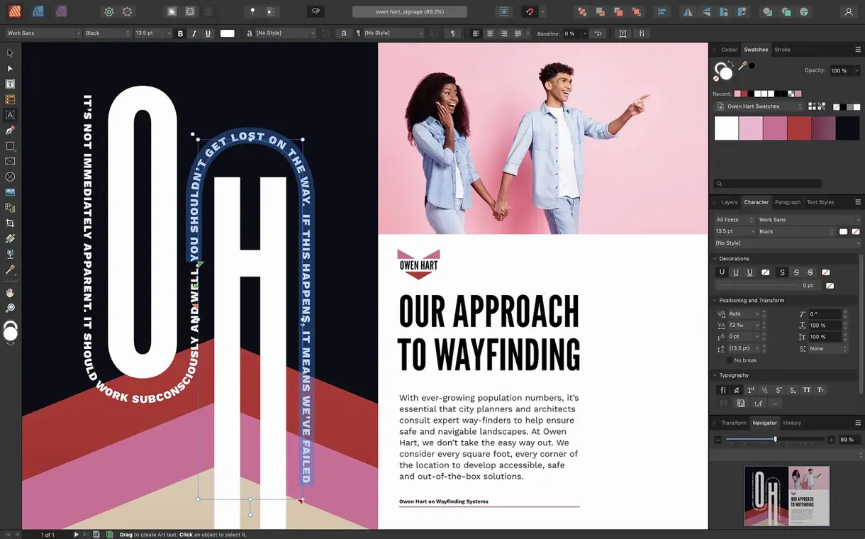
Affinity Publisher is a desktop publishing application for assembling books, magazines, brochures and other multi-page layouts from text, images and vector graphics.
What the 2.6 release introduces
- Multiple-page spreads let you design a single spread that spans more than two facing pages, useful for extended timelines or wide panoramic layouts.
- Foldable spreads add support for gatefolds, trifolds and accordion folds, so you can lay out printed pieces with panels that fold in sequence.
- A Reading Order panel makes it possible to set the sequence in which assistive technology reads PDF content, improving accessibility of exported documents.
What remains familiar
The core toolkit stays intact. You still link text frames across pages, set drop caps and initial words, and draw text frames in any shape using boolean operations. Image editing remains non-destructive through adjustment layers applied directly on the page, and the app continues to export press-ready PDF/X-1a, PDF/X-3 and PDF/X-4 files with CMYK and spot colour support. StudioLink keeps the three Affinity apps connected, so swapping into Affinity Designer or Affinity Photo happens without leaving the layout. Import of PSD, AI, PDF and common raster formats is unchanged, and the application still runs on macOS 10.15 or later on both Intel and Apple Silicon machines.
Setting up a bleed preview before placing content
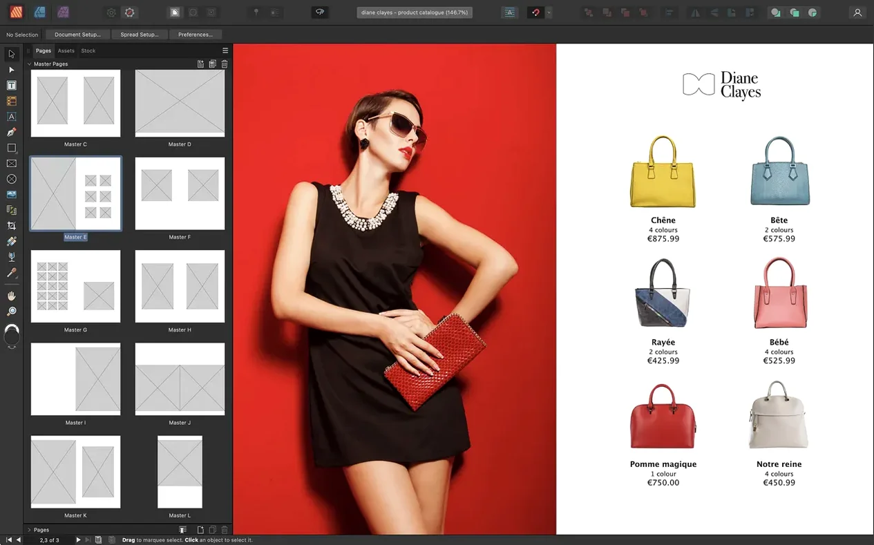
You open the app to a blank spread. Before placing a single element, you set up the document: A4 pages, facing, with a 3 mm bleed on all edges. The New Document panel shows a preview of your page pairs and lets you save the setup as a preset for later issues.
Master pages come next. You assign a two-column grid to the default master, add running headers in text frames at the top, and drop page numbers into the footer. Because masters can nest, you create a variant that inherits the headers and grids but swaps the footer for a chapter-title frame. The Layers panel shows the master layer sitting beneath the live page, its contents dimmed but editable.
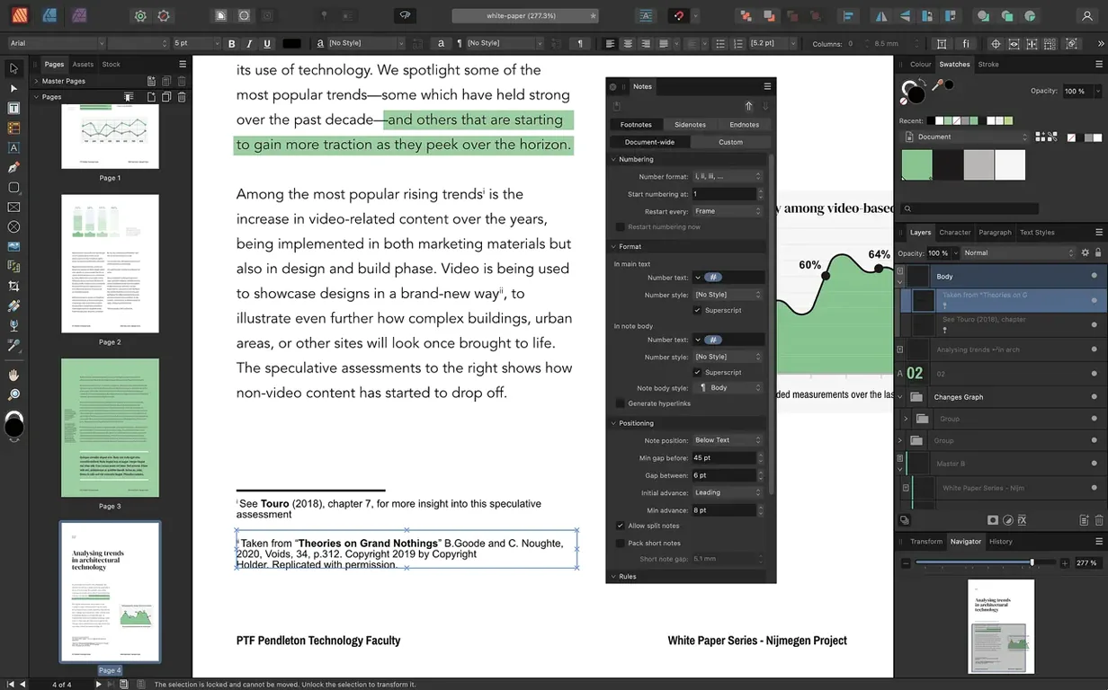
With the skeleton in place, you place a long article. You draw a text frame on page one and paste the copy. An overflow indicator turns red at the bottom edge. Clicking it loads the cursor with the leftover text, and you draw a second frame on page three. A thin arrow appears between them, confirming the link. You repeat this across eleven pages, adjusting frame shapes around planned image positions as you go.
Images come in via drag and drop from a Finder window. A full-bleed photograph fills the opening spread. You apply a slight vignette through an adjustment layer clipped to the image frame, leaving the original file untouched. The Picture Frame Properties panel lets you scale the image within its container without resizing the frame itself — handy when the crop needs tweaking after the client sees a draft.
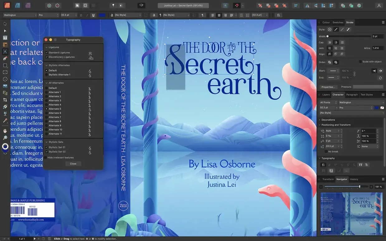
Midway through, you spot a heading that needs a custom ligature. The Typography panel exposes the font's OpenType stylistic alternates, and you toggle the one that fits. A paragraph style captures the change, and you apply it to all chapter heads with two clicks. Text wraps around an irregular vector shape you drew for a sidebar, the wrap boundary hugging the curve because you adjusted the contour in the Text Wrap panel.
Before exporting, you check the Reading Order panel. You drag the article body to the top of the list, followed by sidebars and image alt-text, so a screen reader navigates the content in a logical sequence. The export preset you choose is PDF/X-4, with bleed included and spot colours left intact for the printer.
Steeper learning curve than Scribus for master pages
Scribus offers a similar feature set but within an open-source framework. Its type engine handles OpenType and its preflight checks are thorough, yet the interface feels heavier and the learning curve steeper. Master page workflows in Scribus are functional but lack the nesting behaviour that makes Affinity Publisher's templates quicker to adapt mid-project. Scribus also misses the integrated photo and vector editing that StudioLink provides, meaning you round-trip assets through external editors more often.
Swift Publisher aims at a different corner of the market. It suits shorter documents — flyers, newsletters, single-sheet layouts — with a drag-and-drop workspace that demands less technical knowledge. The trade-off shows in precision work: its grid and guide systems are simpler, its typographic controls are limited to basic kerning and leading, and it does not support CMYK output or PDF/X standards. For anything destined for a commercial press, the gap becomes hard to bridge.
Compared with both, Affinity Publisher occupies a middle ground that leans toward professional output. It matches Scribus on prepress features while staying closer to Swift Publisher in interface immediacy. Where it stands alone is the link to Affinity Designer and Affinity Photo — an arrangement that collapses three specialised tools into one workflow without file conversions or temporary exports.
Running headers pulled from paragraph styles across a novel
Independent book designers and self-publishing authors benefit from the long-document handling. Linked text frames, running headers pulled from paragraph styles, and the ability to combine multiple-page spreads with standard facing pages mean a novel or textbook can live inside one file without splitting chapters across separate documents.
Small magazine teams find the page-layout precision they need without the overhead of subscription-based alternatives. A single designer can build an issue template with nested masters, hand it to an editor who places articles and images, then pass it back for final adjustments. StudioLink lets a photo editor correct images in-place, so the layout stays current while photographs are still being graded.
Marketing designers producing brochures, catalogues and data sheets appreciate the foldable spreads added in 2.6. A trifold brochure can be laid out as one continuous spread with panel guides marking the folds, rather than as three separate pages that you mentally stitch together. The Reading Order panel also serves those who must meet accessibility requirements for public-facing PDFs.
Users who already own Affinity Designer or Affinity Photo gain the most, because the three apps share a file format and a common approach to layers, colour and snapping. Someone comfortable with curves in Designer will find the Pen tool behaves identically here, and adjustment layers from Photo slot into picture frames without a second thought.
Finding hidden text overflow outside the pasteboard
Text overflow goes unnoticed. A long article placed into a single frame may overflow without an obvious visual cue if the frame edge sits outside the pasteboard. The fix is to open the Text Frame panel and set the overflow indicator to a visible colour, or to check frame links by selecting a text frame and looking for the linking arrows in the toolbar. Breaking the text across multiple frames early prevents surprises at export.
Images print blurry despite looking sharp on screen. This usually happens when a low-resolution placeholder was placed and never replaced with the high-resolution original. The Resource Manager panel lists every linked image and its effective DPI at the current scaling. Sorting the list by resolution flags anything below 300 DPI. Replacing the file with a higher-resolution version through the same panel updates all instances across the document.
Spot colours disappear in PDF export. The likely cause is an export preset set to convert everything to CMYK, or a mismatch between the document colour space and the export settings. Switching to a PDF/X-4 preset and confirming that the spot colour swatches are set to spot rather than process in the Swatches panel resolves it. The Output Preview panel lets you check separations before the file leaves the machine.
Performance slows on large documents. Documents with dozens of high-resolution images and complex vector layers can tax even capable Macs. The View menu offers a wireframe mode that temporarily hides fills and effects, making panning and zooming snappier while you adjust layout. Linked images rather than embedded ones keep the file size down, and the Resource Manager can embed or link files in bulk if you need to switch strategies.