 Aspecten
 Download (10 MB)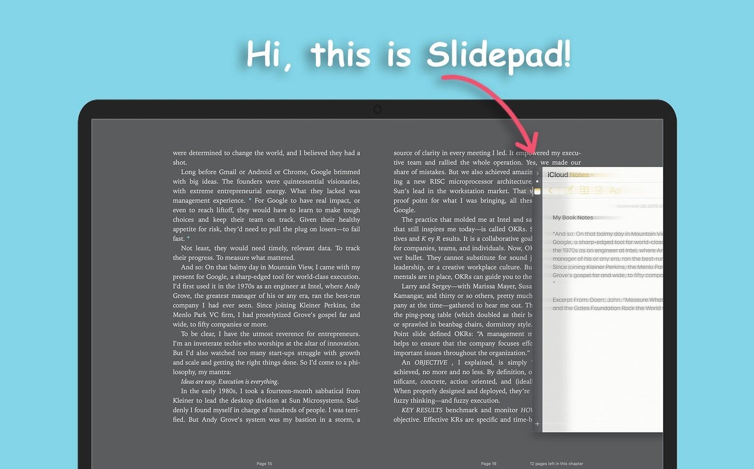
Version 1.6.2 keeps Slidepad in step with recent macOS releases. The update is listed as a maintenance release, so existing users can expect the same behaviour as before while staying current.
| Detail | Note |
|---|---|
| macOS | 11 and later |
| Architecture | Apple Silicon and 64-bit Intel |
| Interface language | English |
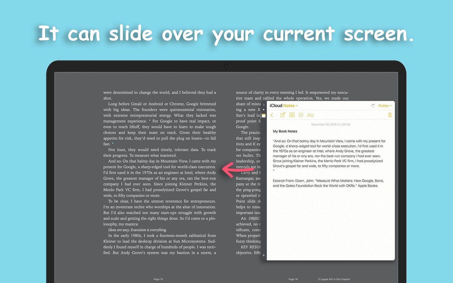
A question that comes up before installing Slidepad is whether it can handle a large collection of web apps without falling over. There is no stated limit on the number of apps you can add. The panel stays responsive even when you have a long list of services pinned, which matters if you plan to use it as a compact launcher alongside a full-size browser. Browsing history is saved per app, and the auto-mute setting lets you silence background tabs before they become a distraction. The panel slides out from the side of the screen in the same way Slide Over works on an iPad, giving you a narrow workspace that tucks away when you do not need it.
How Slidepad compares with similar Mac apps
Slidepad sits in a niche between a full browser and a dedicated web-app wrapper. Two other Mac apps that overlap with its concept are Station and Franz — both mentioned as inspirations — and a third worth comparing is MenubarX, which takes a different approach to the same problem.
Station and Franz are both multi-account web-app containers. They let you log into several accounts on the same service and switch between them inside one window. That is useful for someone managing multiple Slack workspaces or Gmail inboxes, but it also means you live inside a single heavy window. Slidepad does not try to manage accounts. It slides out a narrow panel, gives you one site at a time, and slides back. The interaction is lighter: you are not committing to a workspace, you are glancing at something.
MenubarX lives in the menu bar and drops down a small browser window on click. It is even more transient than Slidepad. The trade-off is screen real estate: a menu-bar popover is fine for a quick WhatsApp check or a to-do list, but cramped for anything that needs a scrollable sidebar or a chat thread with history. Slidepad gives you a taller, wider panel that stays open while you work, which suits messaging apps, note-taking tools and feed readers better than a tiny dropdown.
Where Slidepad wins is speed of access. You summon the panel, pick an app from the list, and interact. There is no tab bar taking up space, no account-switching menu, no pinned sidebar of services. The limitation, compared with Station or Franz, is that you get one web app at a time. If you need three services visible simultaneously, Slidepad is not the tool. But for users who want a quick slide-out companion to a main browser or code editor, the narrow focus is precisely what makes it fit.
Expecting tabs where there are none
New users often treat Slidepad as a miniature Safari and expect tabbed browsing. The absence of tabs catches people off guard. You open one web app, and switching to another means selecting it from the list, which replaces the current view. Beginners who try to keep two apps open side-by-side inside Slidepad quickly realise the panel is designed for one-at-a-time access.
Another common misstep is loading heavy single-page applications and wondering why the panel feels sluggish. A Notion workspace with several databases or a Figma file with many artboards is not what the narrow panel was built for. Those apps want a full-width viewport and plenty of memory. Keeping the panel lean — messaging tools, calendars, simple task lists, RSS readers — keeps it fast.
Some users miss the auto-mute setting in preferences and assume the panel cannot be silenced. A web app playing audio in the background will continue until you either close it or flip the mute toggle. Enabling auto mute from the start avoids the surprise of a sudden notification sound from a hidden panel.
A subtler mistake is treating the omnibox as a general search bar. It accepts URLs and keywords, but the strength of Slidepad lies in pinning specific web apps, not in ad-hoc browsing. Users who bounce between random sites instead of curating a short list of pinned services end up with a panel that feels no different from a cramped browser window. The app works best when the list is deliberate.
WhatsApp and a to-do list pinned beside the code editor
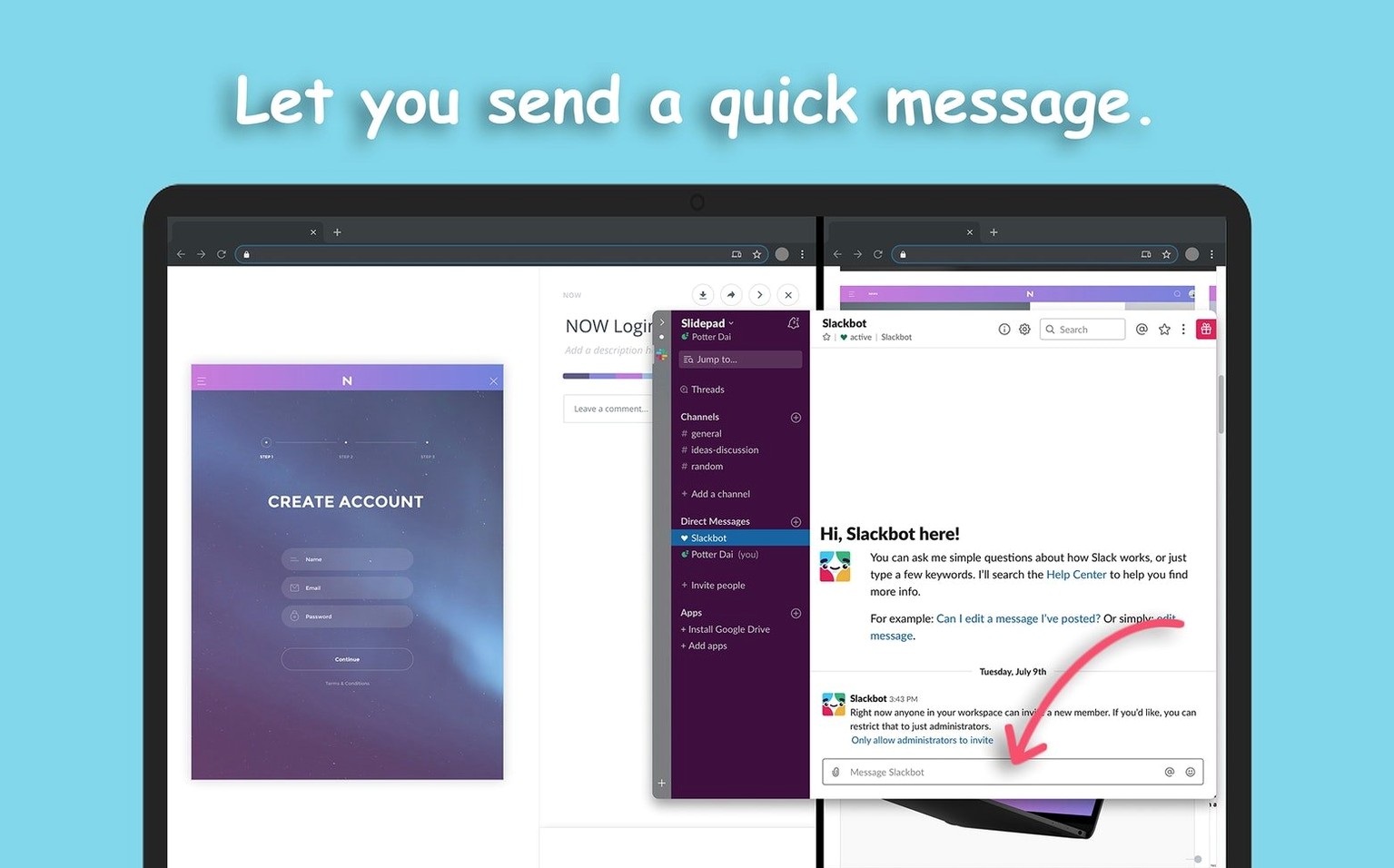
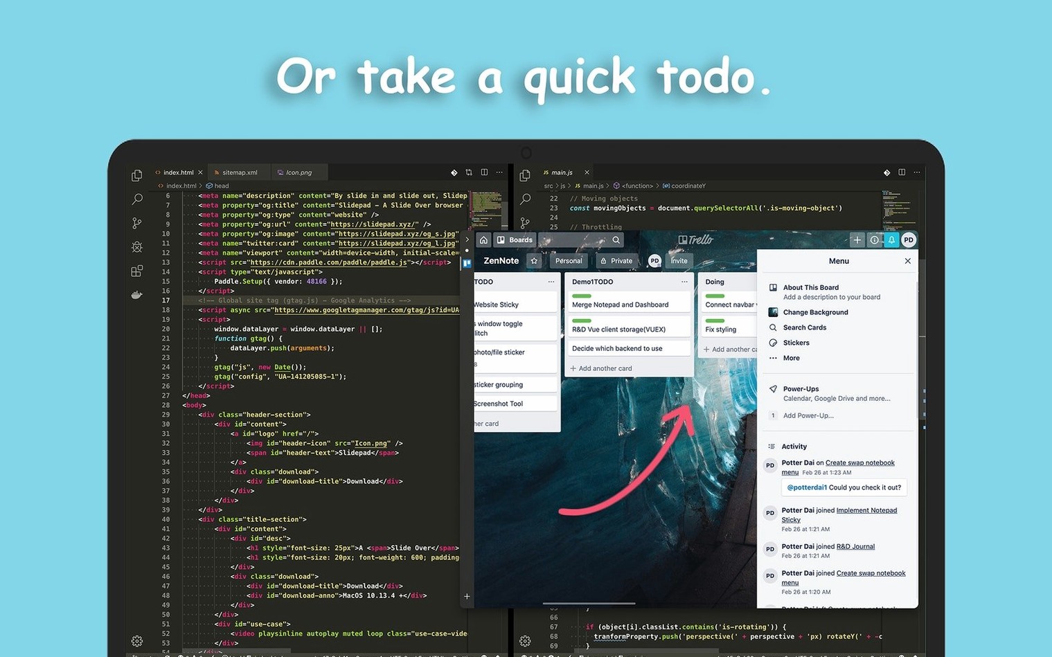
I start the morning with a code editor open on the main display and a design spec in the background. I need WhatsApp and a shared to-do list without switching spaces or hunting through browser tabs. I move the cursor to the screen edge, swipe, and Slidepad slides out from the right.
The panel opens to WhatsApp Web, which I left active the night before. A few unread messages sit in a group thread. I reply and then click the Slidepad icon in the menu bar to pull up the app list. I switch to the team's to-do board — a simple Kanban web app pinned near the top. Two tasks moved to "in progress" overnight. I drag a card across columns with the trackpad, close the panel with a swipe, and return to the editor.
Twenty minutes later a notification sound pings from the panel. I have auto mute off because I want to hear direct mentions. I slide the panel out, see a tagged message in the group chat, reply, and tuck the panel away. The whole interruption takes under fifteen seconds — no window juggling, no browser tab hunt.
Mid-afternoon I open Slidepad to check a delivery tracking page. I type the courier's domain into the omnibox, glance at the status, and close the panel. That site is not pinned; I will probably never visit it again inside Slidepad. That is fine. The omnibox handles one-off lookups without cluttering the app list.
Later I watch a tutorial video in picture-in-picture. I open YouTube from the pinned list, start the video, and drag the PiP window out of the panel before sliding Slidepad shut. The video floats over the editor while I follow along. When the tutorial ends, I close the PiP window and keep working. Slidepad has already disappeared — no window to minimise, no tab to close.