 Aspecten
 Download (68 MB)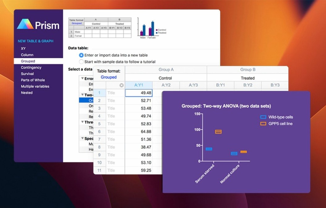
A researcher runs a two-way ANOVA on a multi-variable data set, then builds a box-and-whisker plot from the same table without exporting to another tool.
GraphPad Prism — biostatistics, nonlinear regression and scientific graphing combined in a single application for Mac and Windows.
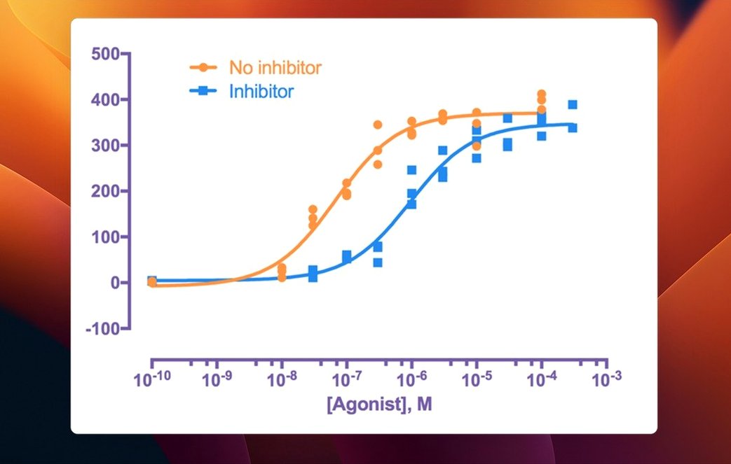
Nonlinear regression — curve fitting tools that handle dose-response curves, enzyme kinetics and receptor binding without separate statistics packages.
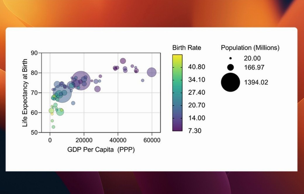
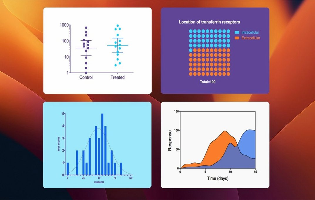
Scientific graphing — publication-ready charts built directly from data tables. Version 11.1.0 adds bars, box-and-whisker plots and violin plots for multiple variables tables.
Analysis guidance — built-in tools help choose the right statistical test and interpret the results, reducing the chance of applying an inappropriate method.
Workflow — data, analysis choices and graphs stay linked. Changing a data point updates the corresponding graph automatically.
The interface keeps familiar functions from earlier versions while introducing refinements to variable selection and categorical ordering. GraphPad Prism runs in English on macOS 11 and later, with native support for both Apple Silicon and Intel Macs.
From raw dose-response data to a fitted XY curve
Imagine a pharmacologist starting the morning with a fresh dose-response experiment. Raw numbers sit in a lab notebook, but the story they tell is not yet visible. The session might unfold like this.
She opens Prism and chooses XY from the welcome dialogue, then picks the Dose-response — Special template. The data table appears with columns for log concentrations and three replicate response values. She pastes the numbers directly from a spreadsheet — no formatting dance required. Prism recognises the column structure and keeps the replicates grouped.
With the data in place, she clicks Analyze. The parameters dialogue opens. In version 11.1.0 the variable selection is streamlined: she picks the response columns in one step rather than ticking through a long checklist. She selects log(agonist) vs. response — Variable slope from the nonlinear regression list. A few seconds later the results tab populates — best-fit values, standard errors, confidence intervals, and a goodness-of-fit summary.
She switches to the graph view. Prism has plotted the curve automatically. She adjusts the axis labels, removes the default title, and sets the colour to match her lab's convention. The graph updates as she works. A colleague walks over and asks about the hill slope; she clicks back to the results table, reads the value with its error, then returns to the curve.
She needs a second graph — a box-and-whisker summary of the same data grouped by concentration. She clicks New Graph, picks the multiple variables option, and selects Box-and-whiskers from the graph types added in 11.1.0. Within a minute it sits alongside the dose-response curve, both drawing from the same source table. No data duplication, no export step.
Before lunch she notices one replicate in the highest concentration looks like an outlier. She returns to the data table, corrects the value, and watches both graphs shift. The Family panel on the left shows every analysis and graph linked to that table. She exports the final graphs as PDF for a manuscript and saves the Prism file with embedded results. The whole session stays inside one application.
Pasting data from Excel or Numbers into the centre of the workflow
Prism is not an island, but it does prefer to be the centre of the workflow. Data usually enters via the clipboard — researchers paste from Excel, Numbers, or a text file. Prism interprets tab-delimited and comma-separated values cleanly. It does not import .xlsx directly, but dragging a .csv onto the dock icon works reliably.
On the export side, graphs go out as PDF, EPS, TIFF or PNG. The PDF vector output matters for journals that redraw figures — paths stay sharp at any resolution. A researcher might export a graph, drop it into a Pages or Word manuscript, and keep the Prism file alongside for revisions. If the reviewer asks for a different error bar style, the fix happens in Prism and the graph is re-exported.
Prism plays well with macOS clipboard persistence. Copying a graph and pasting it directly into a Keynote slide embeds a vector representation. Spotlight indexes Prism files by name but not by the data inside them. Users who want searchable experiment libraries tend to pair Prism with a reference manager like Bookends or Zotero, storing Prism files next to related PDFs.
Automator and Shortcuts have no direct Prism actions, but AppleScript can open specific files. A common pattern: a lab Mac runs a folder action that detects new instrument output files, opens them in a text editor for cleanup, then the researcher pastes the cleaned data into Prism manually. Automation around Prism is light — the heavy lifting stays inside the application.
For collaboration, the .pzfx file format is the lingua franca. A file created on a Mac opens on a Windows machine without conversion, and vice versa. Researchers share files through cloud storage — iCloud Drive, Dropbox, or institutional network shares — without worrying about platform quirks. Prism does not offer real-time collaboration, so teams tend to work sequentially: one person builds the analysis, another reviews it, and the file travels by email or shared link.
A postdoc running a one-way ANOVA on tumour volumes
Bench scientists in biomedical research are the core audience. The software assumes you run experiments, not that you enjoy statistics. A postdoc measuring tumour volumes over three treatment groups finds the one-way ANOVA with Dunnett's post-test exactly where she expects it. The analysis checklist in Prism practically walks her through the assumptions. She does not need to recall whether her data meet sphericity criteria — Prism checks and reports it.
Pharmacologists fitting dose-response curves live in the nonlinear regression module. The four-parameter logistic model is pre-configured. The software reports EC50 values with asymmetric confidence intervals, which matter when publishing in journals that require them. A pharmacologist comparing full and partial agonists across tissues uses the comparison-of-fits feature to test whether curves differ significantly, without exporting to a separate statistics package.
Graduate students learning statistics alongside lab work benefit from the analysis guidance. Prism explains why a test was chosen and what the p-value means in plain English. A student running a t-test sees a sentence-long interpretation — not just a number. This does not replace a biostatistics textbook, but it catches errors early. A student who accidentally runs a parametric test on non-normal data gets a warning.
Principal investigators reviewing results appreciate the linked family structure. An entire experiment — raw data, analyses, graphs, and layouts — lives in one file. A PI can open a postdoc's file, click through each analysis step, and trace a graph back to the source data. There is no mystery about which exclusion criteria were applied or which test was selected.
Prism is less suited for high-throughput bioinformatics. It handles hundreds of data points per table, not tens of thousands. A researcher analysing RNA-seq data will hit performance limits quickly. Those users export from R or Python and then use Prism for final figures and statistical reporting — the graph types and layout tools remain useful even when the heavy computation happens elsewhere.
Choosing Column instead of Grouped for two time points
Pasting data into the wrong table type. Prism offers six table formats — XY, Column, Grouped, Contingency, Survival, and Multiple Variables. A beginner with three treatment groups and two time points often picks Column when Grouped is the correct choice. The analysis menu then shows irrelevant tests. The fix is straightforward: copy the data, create a new table of the right type, and paste. But the moment of confusion is common. A useful habit is to sketch the experimental design on paper and match it to Prism's table descriptions before entering data.
Ignoring the analysis checklist. After running a t-test, the results tab shows a checkbox for equal variances. A beginner clicks through without reading it. The interpretation section flags the assumption, but if the user never scrolls down, they miss it. The same happens with normality tests — Prism runs them by default, but a beginner may report a parametric result without checking whether the data passed.
Using the wrong multiple comparisons test. A student runs a one-way ANOVA comparing all groups to each other and selects Tukey's test — reasonable. Then she runs a second experiment comparing three treatments back to a single control and uses Tukey's again, instead of Dunnett's. Prism does not prevent this. The analysis guidance hints at the right choice, but it cannot override the user's click.
Duplicating data across tables. A newcomer might copy the same dataset into three separate tables to make three graphs. Later, when a value changes, only one table gets updated. The family structure exists to prevent this, but beginners who skip the tutorial do not discover it. Teaching the habit: enter data once, then create new graphs and analyses from the same parent table.
Exporting raster images for journals. A beginner exports a graph as PNG at screen resolution and submits it with a manuscript. The journal's production team requests a vector file. The graph looks fine on screen but prints with jagged edges. Setting the default export to PDF early prevents this. The Send-to-PowerPoint feature also embeds vector graphics if the right option is selected.
Where Prism sits between JMP, OriginPro, and R in ease versus depth
Three applications overlap with Prism in the Mac scientific software landscape: JMP, OriginPro, and R with RStudio. Each occupies a different point on the curve between ease-of-use and analytical depth.
JMP (SAS) offers broad exploratory statistics — principal component analysis, cluster analysis, and interactive data visualisation. It excels at finding patterns in large, messy datasets. JMP's graph builder lets users drag variables onto axes and see the plot change dynamically. Prism is more prescriptive: it guides the user toward a specific analysis and graph type suited to experimental biology. A researcher comparing drug treatments across time points will reach for Prism's grouped analysis first. JMP feels like a statistical workbench; Prism feels like a lab notebook that does the statistics for you.
OriginPro (OriginLab) is the closest competitor in terms of scientific graphing. Its graph customisation runs deeper — every tick mark, every axis break, every fill pattern is adjustable. OriginPro handles larger datasets and includes peak analysis, signal processing, and image processing tools that Prism simply does not attempt. The trade-off is interface complexity. OriginPro's dialogue boxes are dense; a new user can spend an afternoon learning to format a single graph. Prism produces publication-ready output faster, but with fewer customisation options. A researcher whose graphs must match the exact specifications of Nature's art department might prefer OriginPro's fine control. A researcher who needs the graph to be correct and clear — and needs it by a lab meeting in 20 minutes — tends to stick with Prism.
R with RStudio sits at the opposite end of the spectrum. It is free, scriptable, and capable of any analysis in the biostatistics literature — if the user writes the code. The ggplot2 package produces graphs of extraordinary flexibility and beauty. A bioinformatician working with RNA-seq counts, normalisation factors, and custom generalised linear models works in R because no point-and-click tool covers that ground. Prism does not compete with R on analytical breadth. It competes on reproducibility without scripting. A Prism file is self-contained; an R script requires package versions, runtime environments, and the habit of commenting code. For a wet-lab scientist running a Western blot and a dose-response curve, Prism removes the coding step entirely.
In practice, many Mac users run two of these tools. A lab might standardise on Prism for routine analyses and keep JMP or R for exploratory work. The .pzfx file travels easily, and the graphs export cleanly into whatever the final workflow demands.