 Aspecten
 Download (6 MB)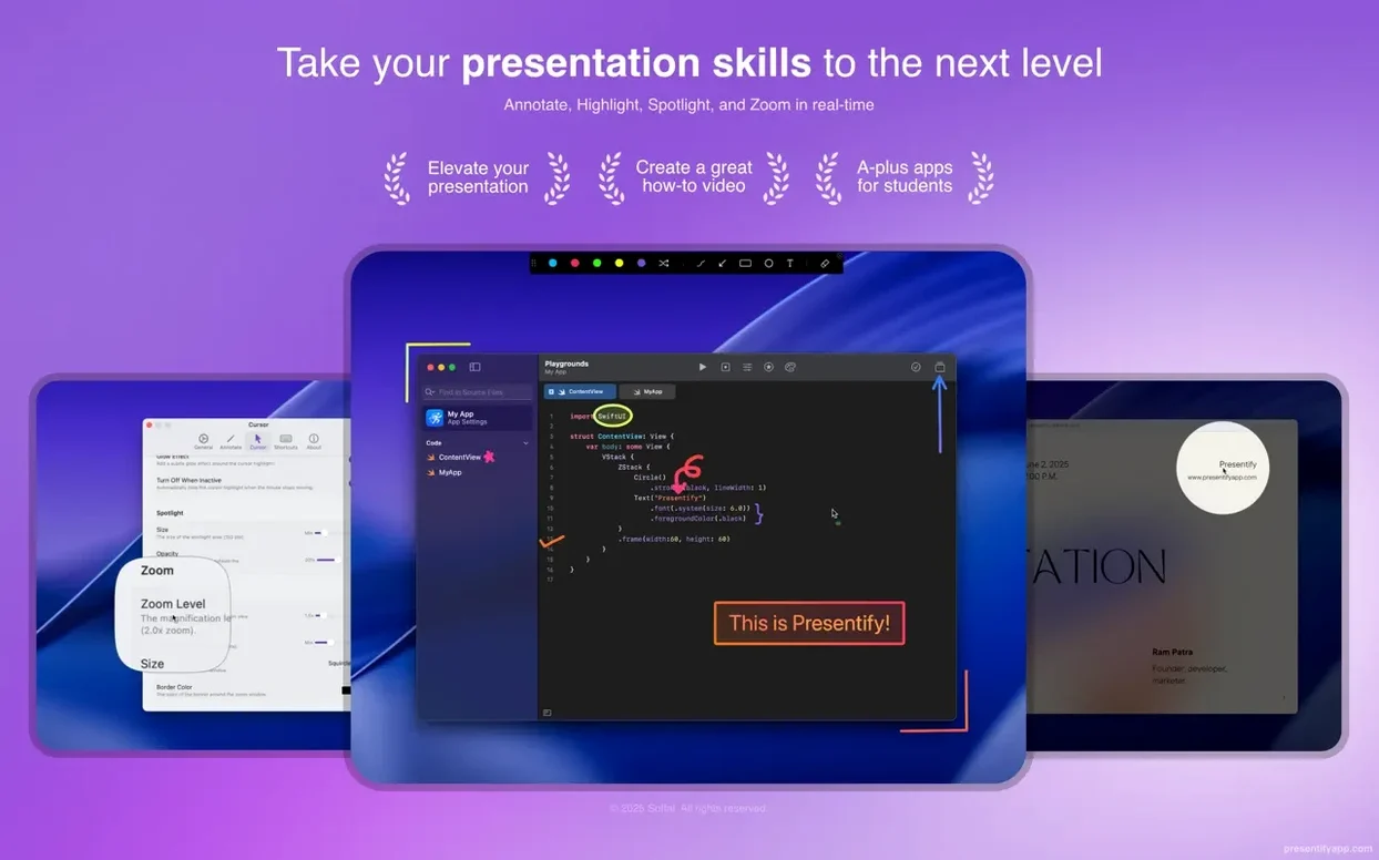
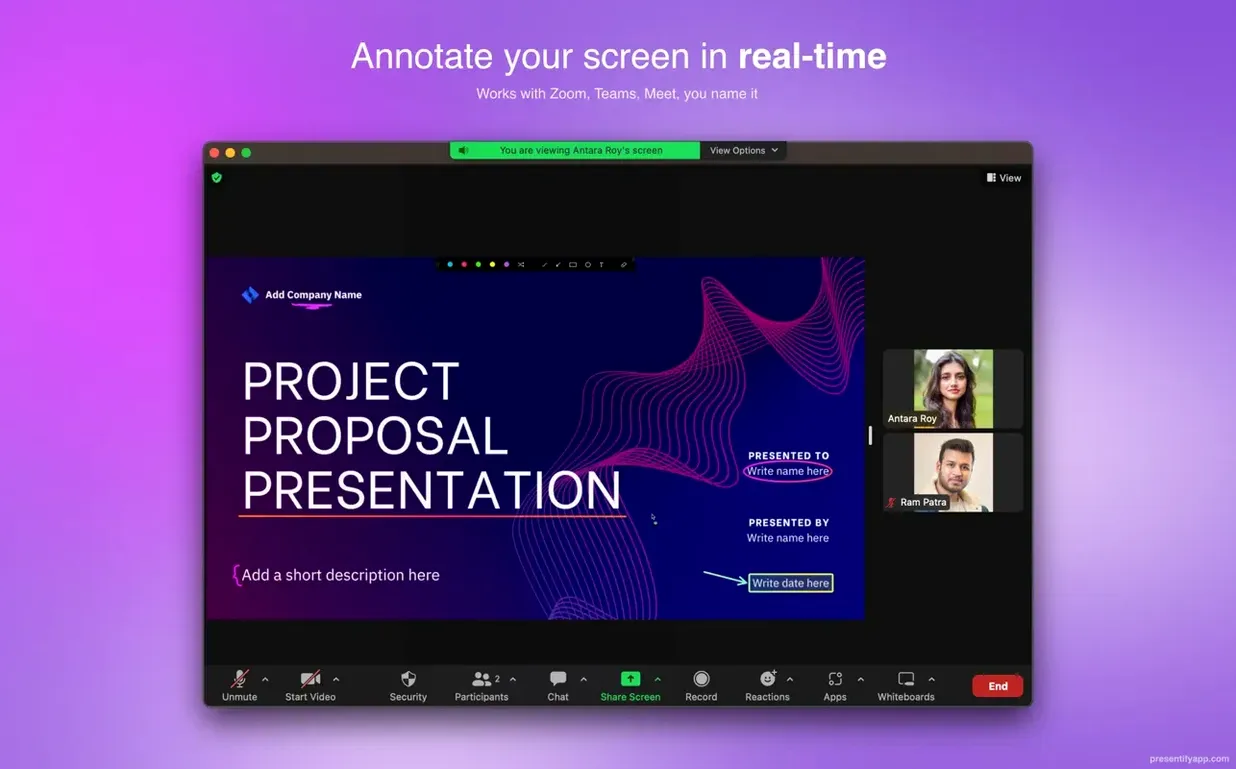
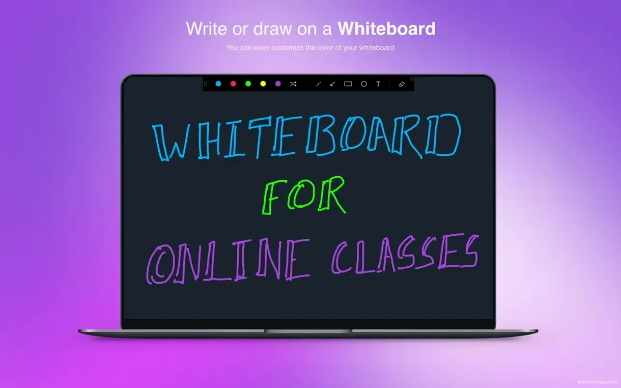
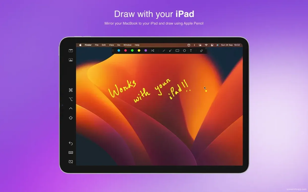
Anyone who presents a screen — a lecturer stepping through code, a designer reviewing mock-ups, a trainer building a software tutorial — can use Presentify. It sits in the menu bar and turns the whole display into a surface you can draw on, without interfering with the application behind your marks.
Drawing tools live in a tiny menu bar panel
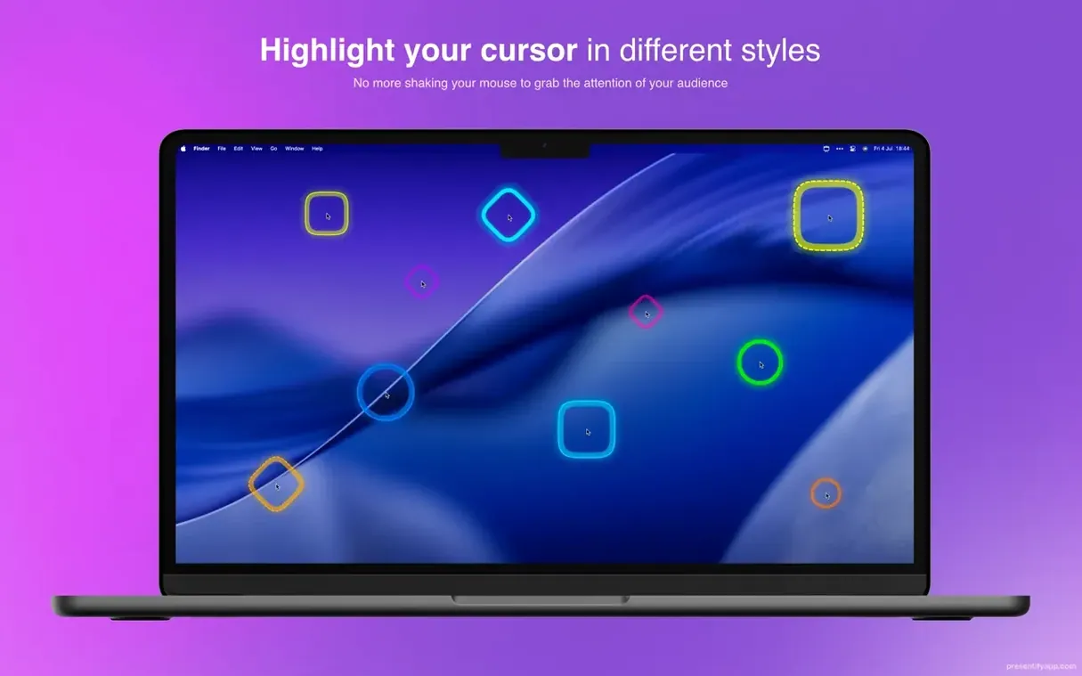
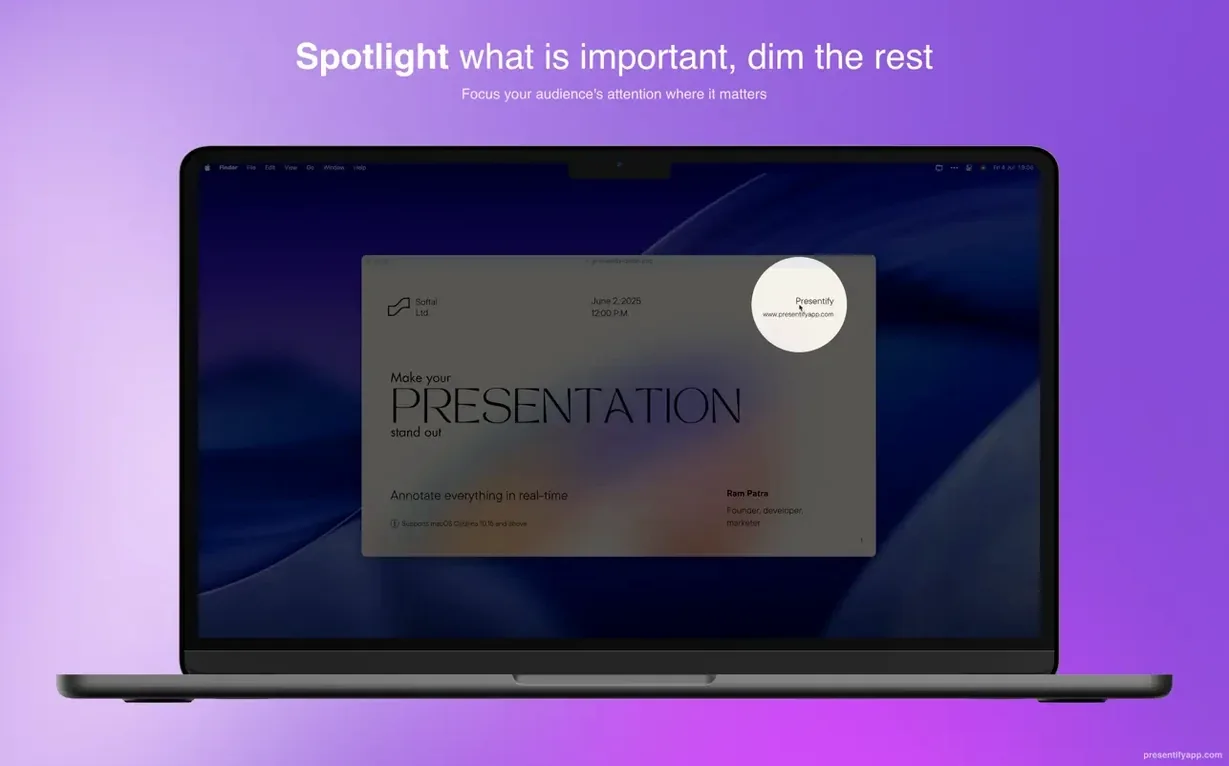
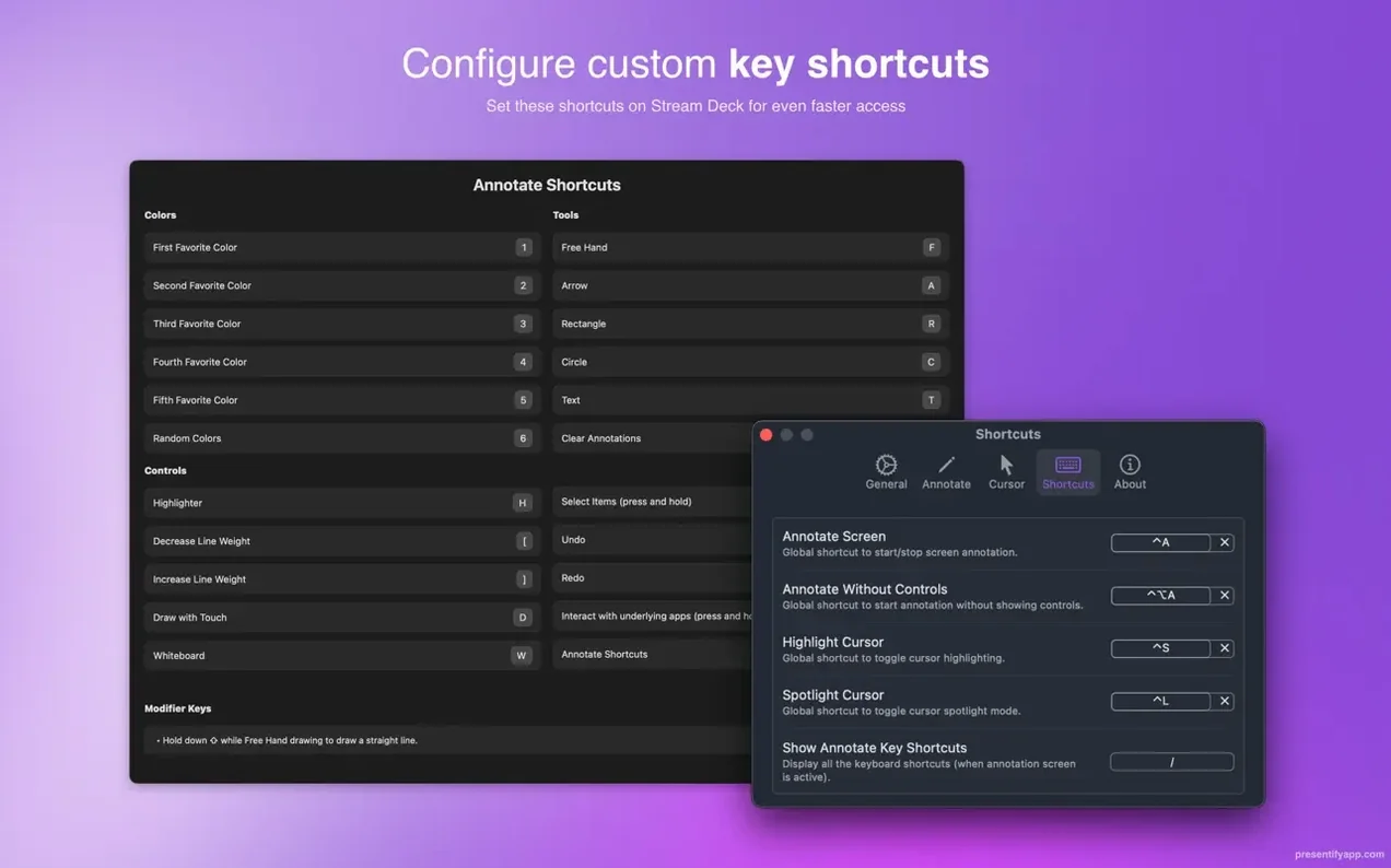
The controls live in a small menu bar panel. Colour, stroke width and tool type are set there before you draw. A separate toggle switches on cursor highlighting and a dimmed vignette that spotlights a circular area around the pointer. The app works at the system level, so annotations float over images, videos, PDFs and code editors alike. Holding the Fn key in the default mode lets you click through the marks to interact with basic apps underneath, which keeps a live demo functional while you sketch on top of it.
Highlighting text keeps characters readable underneath
Annotation feels immediate. You can highlight a line of text and the app leaves the characters readable instead of painting over them, a detail that matters when you are walking someone through a passage or a block of code. Full-screen mode is supported, so the tools stay available during a Keynote deck or a video played at full size. The feature set is deliberately narrow — draw, highlight, spot, zoom — and that makes the app quick to pick up between meetings or mid-lesson. Version 8.1.3 runs on both Apple Silicon and Intel Macs with macOS 13 Ventura or later, and the interface is localised into English, German, Spanish, French and Russian. No new features landed in this release; the update keeps the tool stable on current hardware.
Forgetting annotation sits on a transparent overlay
A handful of early slip-ups come up often enough to mention. The first is forgetting that Presentify draws on a transparent overlay. New users sometimes try to tap a button or drag a slider in the application underneath and find nothing responds, because the annotation layer is intercepting every click. Holding Fn solves this straight away: it temporarily passes clicks through to the app below. People who skip the onboarding often miss that entirely and assume the tool has locked them out of their own desktop.
Another common misstep is leaving annotations to pile up. The app can auto-erase after a set interval, but if that is switched off, old arrows and circles stay visible across every window and workspace until you clear them manually. A presenter switching from a slide deck to a live browser tab can end up with yesterday's diagram still floating over the page. Setting a short auto-erase window — fifteen or twenty seconds — keeps the screen clean without interrupting flow.
Beginners also tend to draw with the default colour and thickness on busy backgrounds. A thin red line that looked crisp on a white document becomes nearly invisible over a dark code editor or a photograph. Cycling through the palette before starting a session, and keeping the stroke wide enough for video compression, makes annotations readable for remote viewers watching at lower resolution.
Random gradient colour cycles through blended hues
A few details in Presentify are easy to overlook because the menu bar panel does not advertise them. One is the random gradient colour option. Instead of picking a single flat hue, you can let the app cycle through blended colour pairs each time you draw. The effect is subtle on a static screenshot but helps successive marks stand apart during a long explanation, especially when you are layering several annotations on the same frame.
The text annotation tool is another quiet addition. You click where you want the label and type, and the text sits on the same overlay as the drawings. It is not a full text box with formatting; it is closer to a sticky note in spirit. Still, it removes the need to scribble keywords with a mouse when a clean word or two would do the job better.
Graphics tablet owners get a small but meaningful benefit. Presentify recognises pressure input from Wacom and XP-Pen devices, so lines taper naturally rather than looking machine-drawn. There is no separate driver or preference to enable — the app simply picks up the tablet once it is plugged in. For anyone hand-writing equations or annotating diagrams with a stylus, this lifts the result from functional to legible.
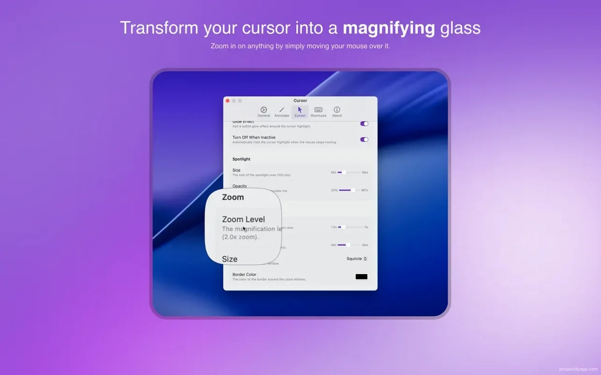
The zoom tool sits in the same menu bar strip and works independently of the drawing controls. You can magnify a region without annotating it, or annotate without zooming. When both are active, the zoom window floats above the marks, so a presenter can enlarge a detail while arrows and highlights remain visible at normal size elsewhere on the screen.
ScreenBrush leans playful with stamps and preset shapes
Presentify shares shelf space with a few other screen annotation tools, each with a different emphasis. ScreenBrush takes a more playful approach: it offers a wider set of drawing tools, including stamps and pre-made shapes, and feels closer to a digital whiteboard layered over the desktop. Where Presentify keeps its toolset tight — draw, highlight, spot, zoom — ScreenBrush gives you more to play with but requires more clicks to switch modes mid-presentation. The overlay principle is the same, but ScreenBrush targets creative demos, while Presentify suits instructional walkthroughs that need to stay clean and fast.
DemoPro leans further toward video production. It records the screen alongside annotations and includes a built-in editor for trimming and exporting clips. Presentify does none of that; it annotates live and leaves recording to other apps. If you need to produce polished tutorial videos in one tool, DemoPro covers more ground. The trade-off is weight: DemoPro runs as a full application with a project library, whereas Presentify stays in the menu bar and activates with a click. For a live class or a meeting where you need to mark something up quickly and move on, the lighter app fits the moment better.
Compared with both, Presentify's cursor-highlight and spotlight features stand apart. ScreenBrush offers a basic cursor glow; DemoPro expects you to handle cursor emphasis in post-production. Presentify gives you a dimmed vignette around the pointer and a coloured halo that follows every movement, which is particularly useful when guiding viewers through dense interfaces or tiny UI elements that are easy to lose on a compressed video stream.
Trainer sets a warm colour for a live debugging demo
Imagine a software trainer preparing a short live demo on debugging a web layout. The session runs over Google Meet, with a dozen attendees watching. She opens Presentify from the menu bar and sets the drawing colour to a warm orange, thick enough to register on a laptop screen. She ticks the auto-erase option at twenty seconds and enables cursor highlighting with a soft yellow glow.
She shares her screen and opens the browser. The page loads with a broken flexbox grid, and she starts talking through the markup. As she points to a misplaced div, the yellow halo draws eyes straight to the element she is describing. She holds Fn, clicks into the code editor, and types a small fix. The annotation layer stays present but does not block her input.
A trainee asks why a particular CSS rule overrides another. She pauses, draws a quick oval around the offending line, and scribbles "specificity" next to it with her Wacom stylus. The line tapers at the end, natural and readable. Twenty seconds later the oval fades, leaving the screen uncluttered for the next point. She switches to a PDF of the design mock-up, circles the margin value that needs adjusting, and continues without once leaving the shared screen or breaking eye contact with the audience. The whole Presentify setup added three clicks to her workflow and no visible friction for the viewers.