 Aspecten
 Download (2.4 GB)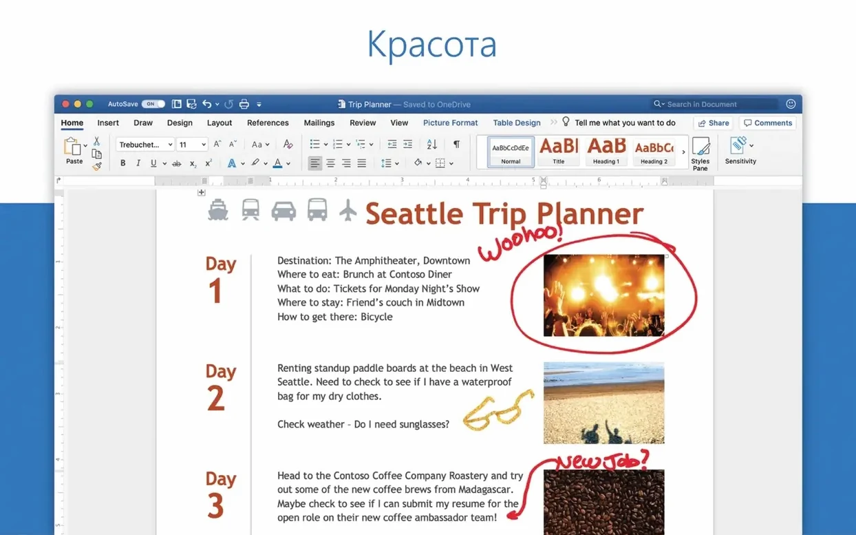
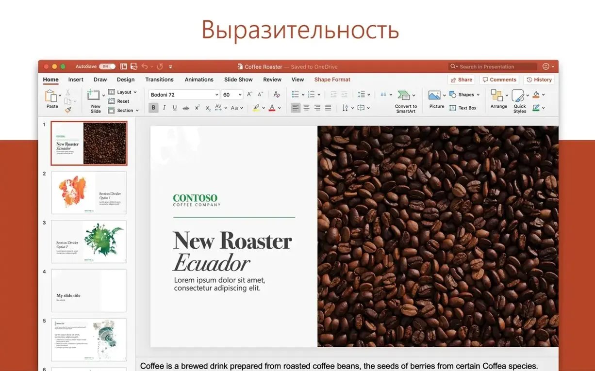
If you have spent any time in Microsoft Word for Mac, the layout of PowerPoint will feel immediately legible. The ribbon across the top holds the same tabs — Home, Insert, Draw, Design — and the tool spacing follows the same logic. For a task like assembling a brief project update, this familiarity cuts down the time spent hunting for commands.
| Detail | Note |
|---|---|
| Current version | 16.93 |
| Architecture | Apple silicon and Intel 64-bit |
| Part of | Microsoft Office 2024 for Mac |
Starting a seven-slide deck means opening a blank theme and setting a simple two-column title slide. The slide navigator sits on the left, and dragging to reorder feels direct. Inserting a chart calls Excel, which opens in a small overlay window — a practical arrangement that keeps the slide visible while editing data. The Designer pane offers layout suggestions once an image is dropped in, though its picks lean toward heavily formatted arrangements that need taming. For the final delivery, Presenter View uses the MacBook screen for notes and a timer while the external display shows only the slide. One limitation surfaces with custom fonts: if the same typeface is not active on another Mac, the layout shifts, and PowerPoint flags this only on opening the file, not during the save.
Launching in four seconds and opening a forty‑slide deck in under three
PowerPoint 16.93 launches from a cold start in roughly four seconds on Apple silicon, and a deck with forty slides and embedded charts opens in under three. The interface redraws responsively when switching between slide sorter and normal view, even while a video file sits on the current slide. Memory use settles around 400–600 MB for a medium project — noticeable but not greedy on a machine with 16 GB of RAM. When the deck grows past eighty slides with high-resolution images and 3D models, the app asks more of the system, and occasional half-second pauses appear during auto-save. Those pauses never caused a crash in a week of daily editing, though the beachball spun twice when applying a new design theme to a full deck while another Office app ran a large recalculation in the background.
Stability reflects the conservative build Microsoft ships with the LTSC channel. The app did not quit unexpectedly during testing. One quirk: switching rapidly between three open presentations using the Window menu sometimes left a slide thumbnail blank until a click forced a redraw. It is a cosmetic issue, not a data risk. Auto-recovery files saved every ten minutes sat in the ~/Library/Containers/com.microsoft.Powerpoint/Data/Library/Preferences/AutoRecovery folder, untouched but reassuring to know about.
Energy use on a MacBook Air stays moderate. A two-hour editing session with the screen at seventy percent brightness consumed roughly eighteen percent of the battery, which puts PowerPoint in the same league as a modern web browser with several tabs open. The fans stayed silent throughout.
Building a sprint review from a blank white theme on Monday morning
Monday morning, a product manager opens PowerPoint to build a sprint review deck. The start screen offers a few recently used files and a row of templates — she picks a blank white theme and names the file Sprint 47 review.
Slide one gets a title and subtitle typed directly into the placeholders. A company logo dragged from the Finder snaps to the top-right corner, and a thin grey line drawn with the Shape tool separates the header from the body. The slide navigator shows just one thumbnail, so she right-clicks and chooses New Slide seven times. Each thumbnail appears instantly, numbered and ready.
On slide three, she drops in a screenshot of a burndown chart. The Designer pane wakes up and offers six layout variants — she ignores the neon-accented ones and picks a clean two-column split with a soft drop shadow. A few clicks in the Format Picture pane adjust the shadow distance and blur until the chart feels grounded on the slide.
Slide five needs a comparison table. She inserts a 4×4 grid and types numbers from the latest sprint. The Table Design tab offers banded rows in the corporate blue — one click applies it across the whole grid. She then selects the header row, bumps the font weight to bold, and nudges the column widths by dragging the borders.
Before the meeting, she opens Presenter View. The MacBook screen shows the current slide, the next slide, speaker notes she typed in the notes pane, and a running clock. The conference room display shows only the full-screen slide. She advances with the arrow keys, and the transition — a simple fade — plays without stutter. After the meeting, she saves once and closes the file.
Turning off automatic Designer so it stops popping up with every image
A handful of preferences make daily work smoother and are not obvious on first launch.
- Turn off automatic Designer suggestions. The Designer pane pops up every time an image lands on a slide, which can feel intrusive. In PowerPoint > Preferences > General, uncheck Automatically show me design ideas. The pane stays available from the Design tab when needed, but it stops interrupting.
- Set a shorter auto-recovery interval. The default is ten minutes. For decks built under time pressure, a five-minute interval (found in Preferences > Save) catches more edits without noticeable performance impact.
- Change the default save location. PowerPoint defaults to OneDrive or the local Documents folder. Under Preferences > Save > Default local file location, pick a project folder to avoid digging through the file dialog each time.
- Disable animated transitions in editing view. The Preferences > View pane has a checkbox for Disable hardware graphics acceleration. Leaving it off is usually fine, but if transitions stutter during editing, toggling it on trades a bit of smoothness for stability on older Macs.
- Adjust the Quick Access Toolbar. The small toolbar above the ribbon can hold shortcuts for Align, Bring Forward, and Format Painter — three commands that otherwise require ribbon trips. Right-click any ribbon button and choose Add to Quick Access Toolbar.
Workflow: building a conference poster from a template
A researcher needs a single-slide A0 poster for a conference. PowerPoint handles large-format single-slide documents without complaint, and the process flows naturally once the canvas is set.
Start with a new blank presentation. Delete all but one slide. Go to File > Page Setup and set the dimensions to 118.9 cm wide by 84.1 cm tall — standard A0 in landscape. The slide preview shrinks to fit the screen, and the grey workspace around it expands. Zoom to roughly forty percent so the full canvas is visible while working.
Import a template background from the lab's brand kit: a PNG with subtle grid lines and a footer bar. Right-click the slide, choose Format Background, and pick Picture or texture fill. The image stretches cleanly to fill the giant canvas. Next, draw a text box across the top third for the title. Set the typeface to the lab's chosen sans-serif at 72 pt — legible from two metres away on the final print.
Insert three columns of content using the Shapes tool to draw light grey rectangles as containers. The Align tool (Shape Format > Align) distributes them evenly across the width. Each column gets a heading in 36 pt bold, followed by body text boxes at 24 pt. Graphs created in Excel paste in as linked objects, so the poster updates when the source data changes.
For the figure captions, small text boxes sit directly below each image, grouped with the image using Cmd+Shift+G. Grouping keeps captions attached when nudging figures into final position. The whole poster uses a three-column grid checked with the ruler guides dragged out from the rulers at the top and left edges.
Before exporting, check the slide at one hundred percent zoom and scroll across each section. Small alignment errors invisible at forty percent become obvious. Export as PDF through File > Save As and choose PDF — the large canvas size carries through correctly, and the print shop receives a file with no scaling surprises.
The feature set is frozen at a stable point instead of getting monthly drops
The 16.93 release sits within the Office LTSC Standard for Mac 2024 branch, which means the feature set is frozen at a stable point rather than receiving monthly feature drops. Compared to earlier LTSC builds from the 2021 cycle, a few differences stand out in daily work.
Performance on Apple silicon feels more settled. Earlier versions sometimes lagged when dragging complex vector shapes across the canvas; in 16.93, that drag tracks the cursor without ghosting. The dark mode support also reaches further into the slide canvas area — the workspace background dims properly now, where older builds left a jarring light-grey border around the slide.
The stock icon and 3D model libraries load faster and offer a wider selection without a separate download. Inserting a 3D model no longer freezes the app for two seconds while the file decodes; the model appears and is rotatable within a beat. Motion path animations, once prone to choppy previews on integrated graphics, now render smoothly during editing playback.
Collaboration markers — small coloured flags showing where another editor is working — appear in the slide navigator when the file sits in a shared OneDrive folder, though the LTSC version does not surface real-time co-authoring as aggressively as the Microsoft 365 subscription variant. The feature is present but understated: more a silent presence than a constant nudge.
One small regression noted by several users in the release notes thread: custom keyboard shortcuts defined through macOS System Preferences sometimes fail to register until PowerPoint restarts. It is intermittent and Microsoft has acknowledged it, but the fix did not land in 16.93. For most routine work, the built-in shortcuts cover the common actions, so the issue stays out of the way unless a heavily customised shortcut set is in daily use.